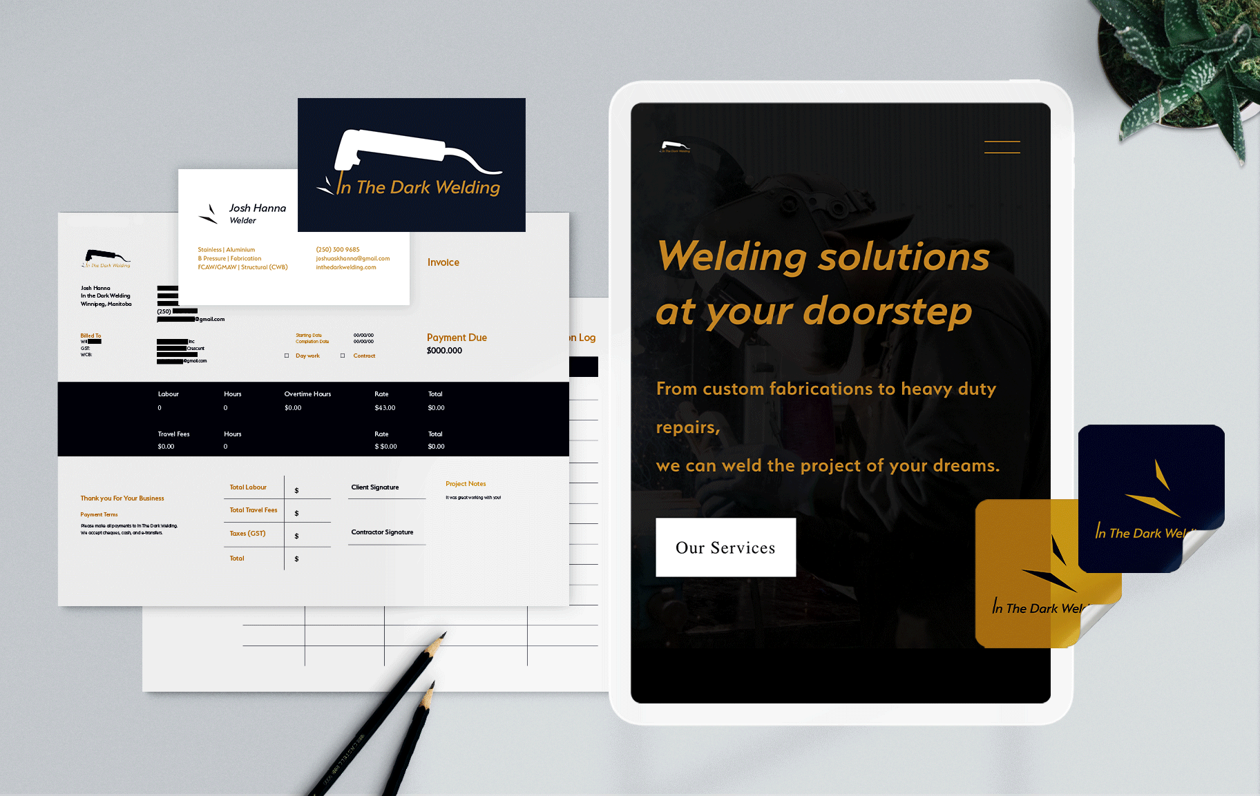
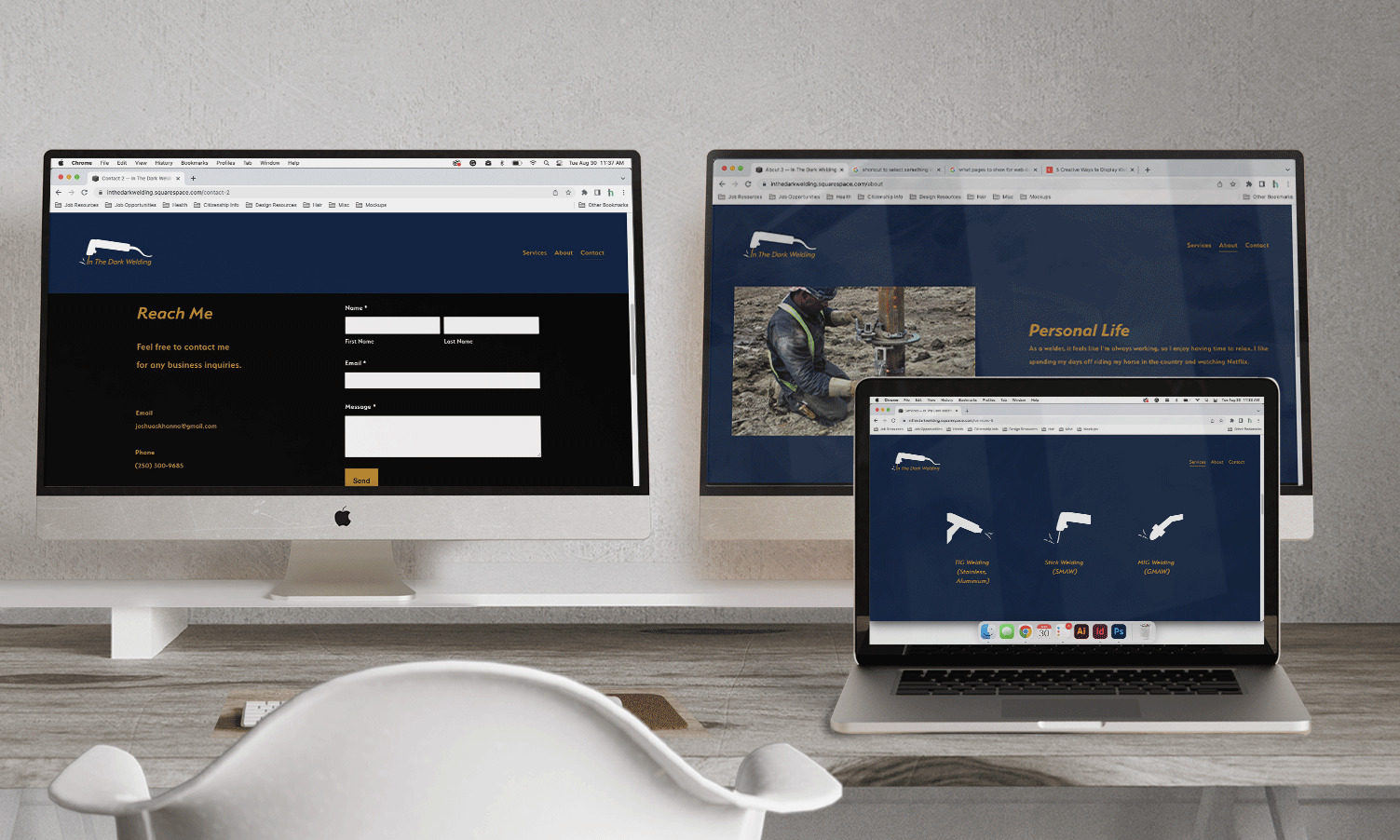
This project aims to create a visual identity that promotes affordability and high-quality services.
Great brands only follow trends of longevity and purpose
Challenge
The main hurdle for this project was identifying effective deliverables that would convey the company's values and services to potential clients.
Creative solutions highlighted the core principles: fairness, variety, and quality.
Creative solutions highlighted the core principles: fairness, variety, and quality.
Process
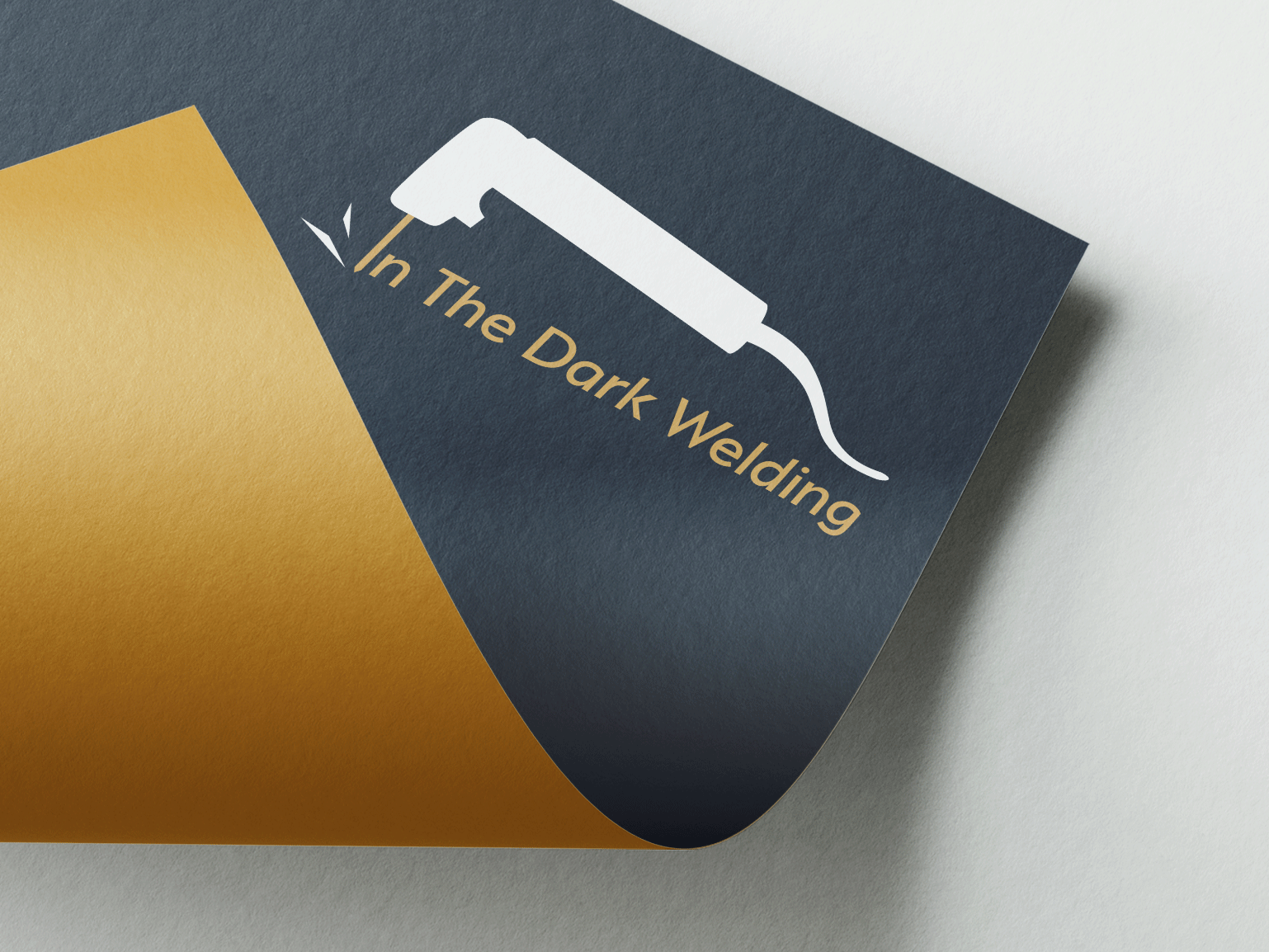
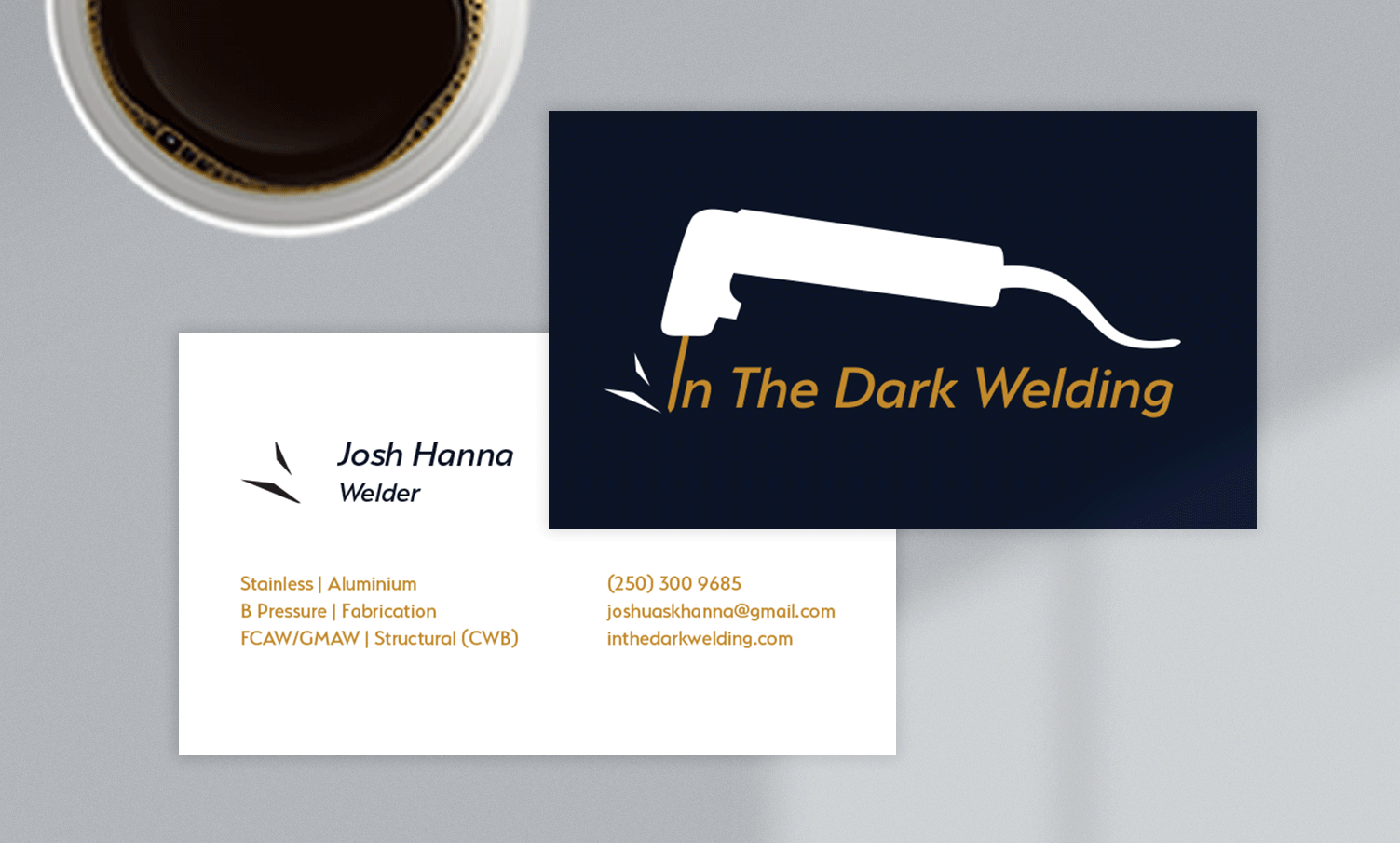
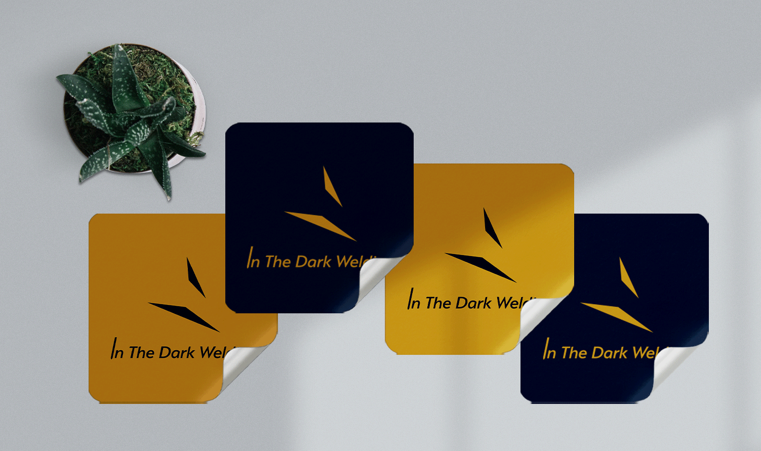
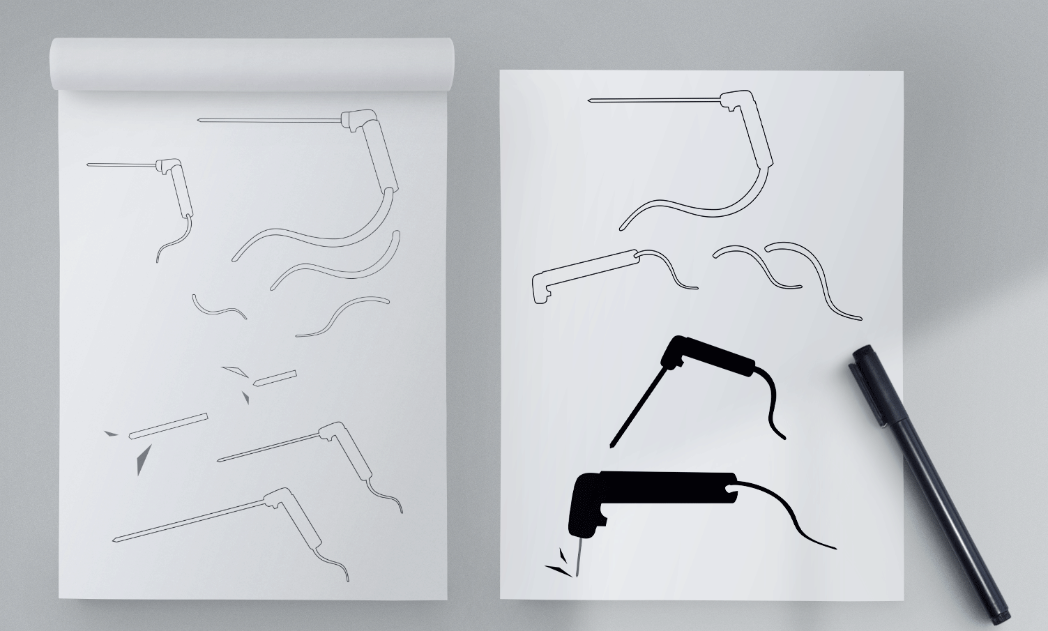
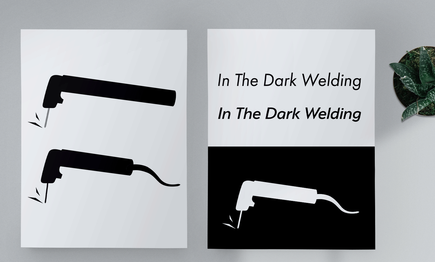
The visuals drew inspiration from a stinger (specialty welding tool), the company name, and the welder's POV through their helmet.
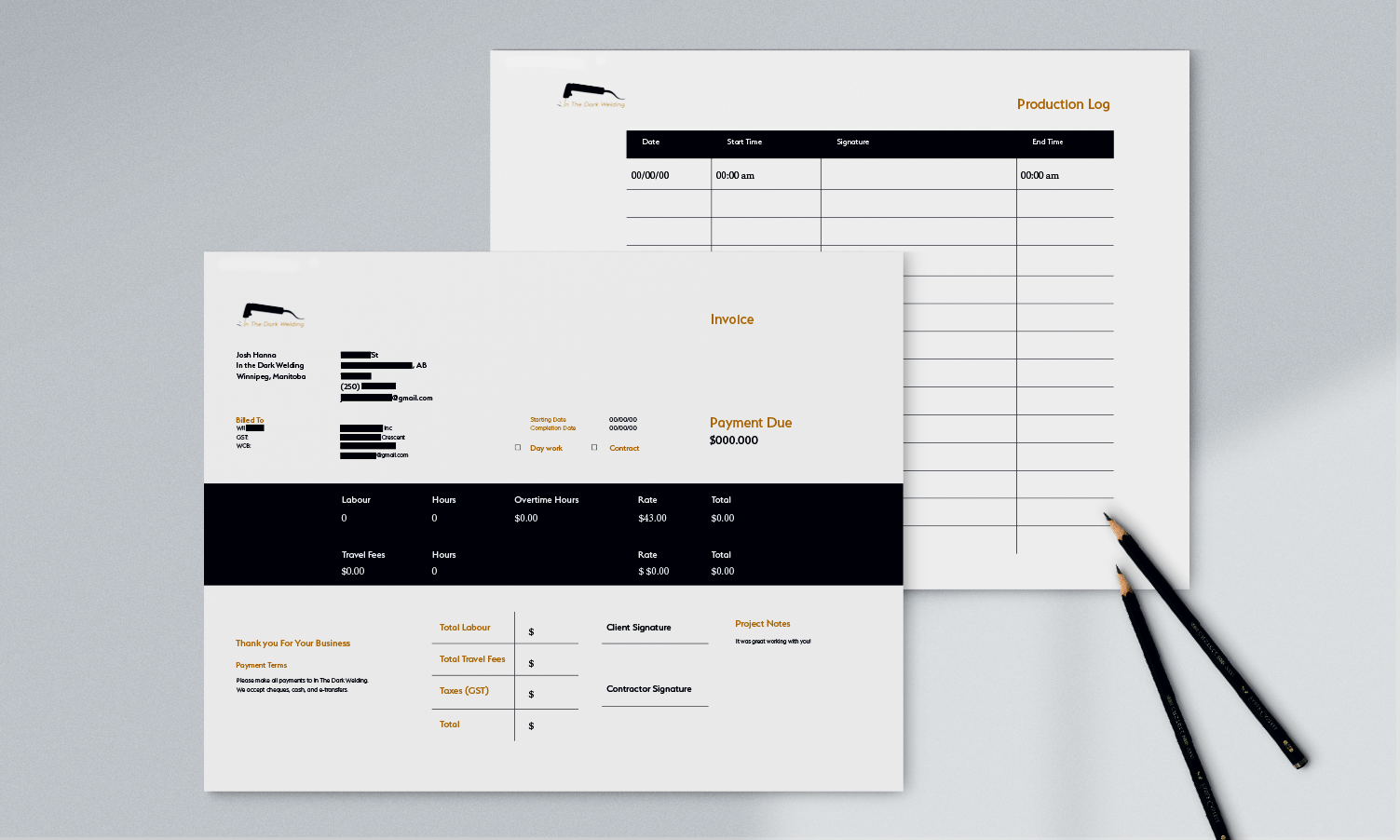
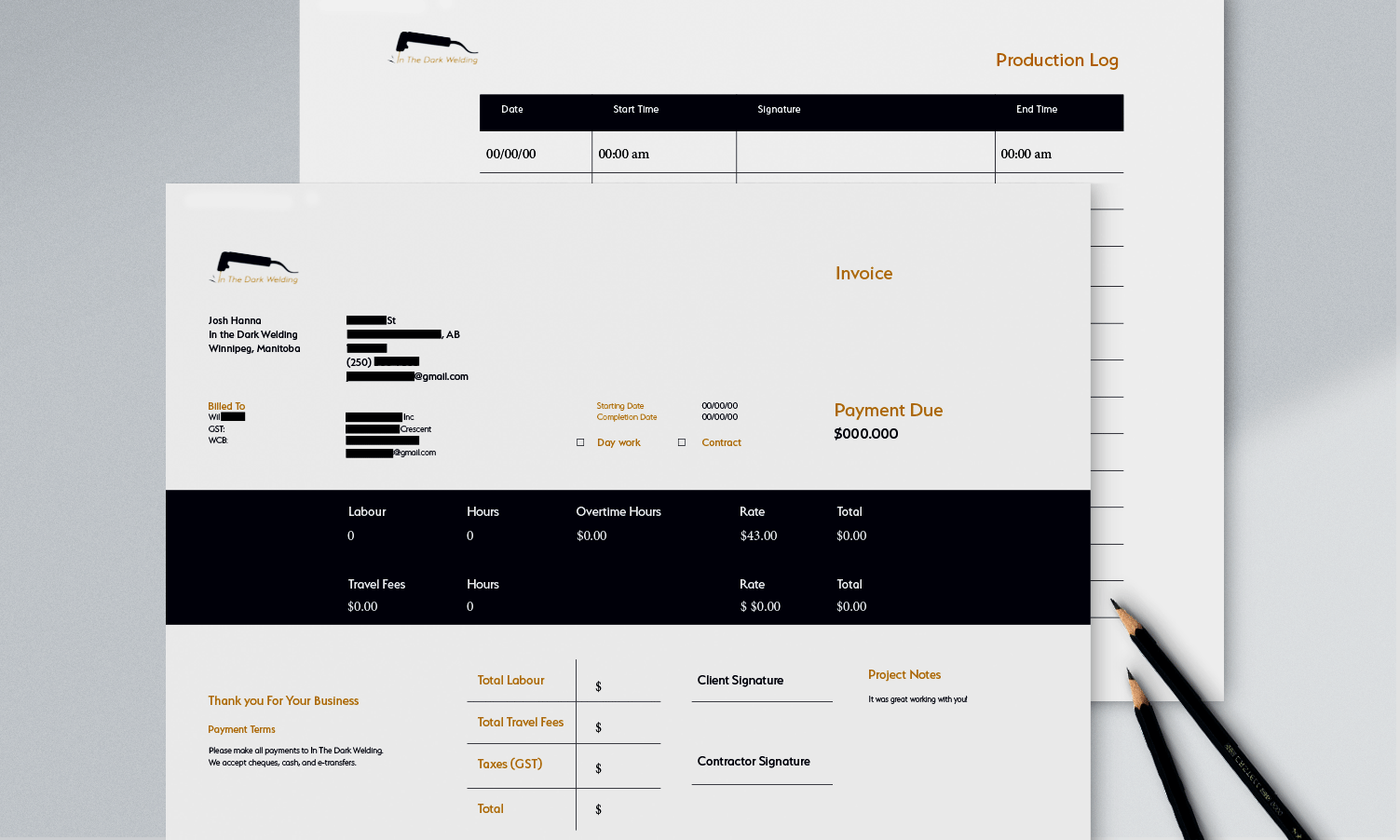
This led to the development of stickers for marketing and advertising, an editable invoice, and a production log to document labour hours
Planning
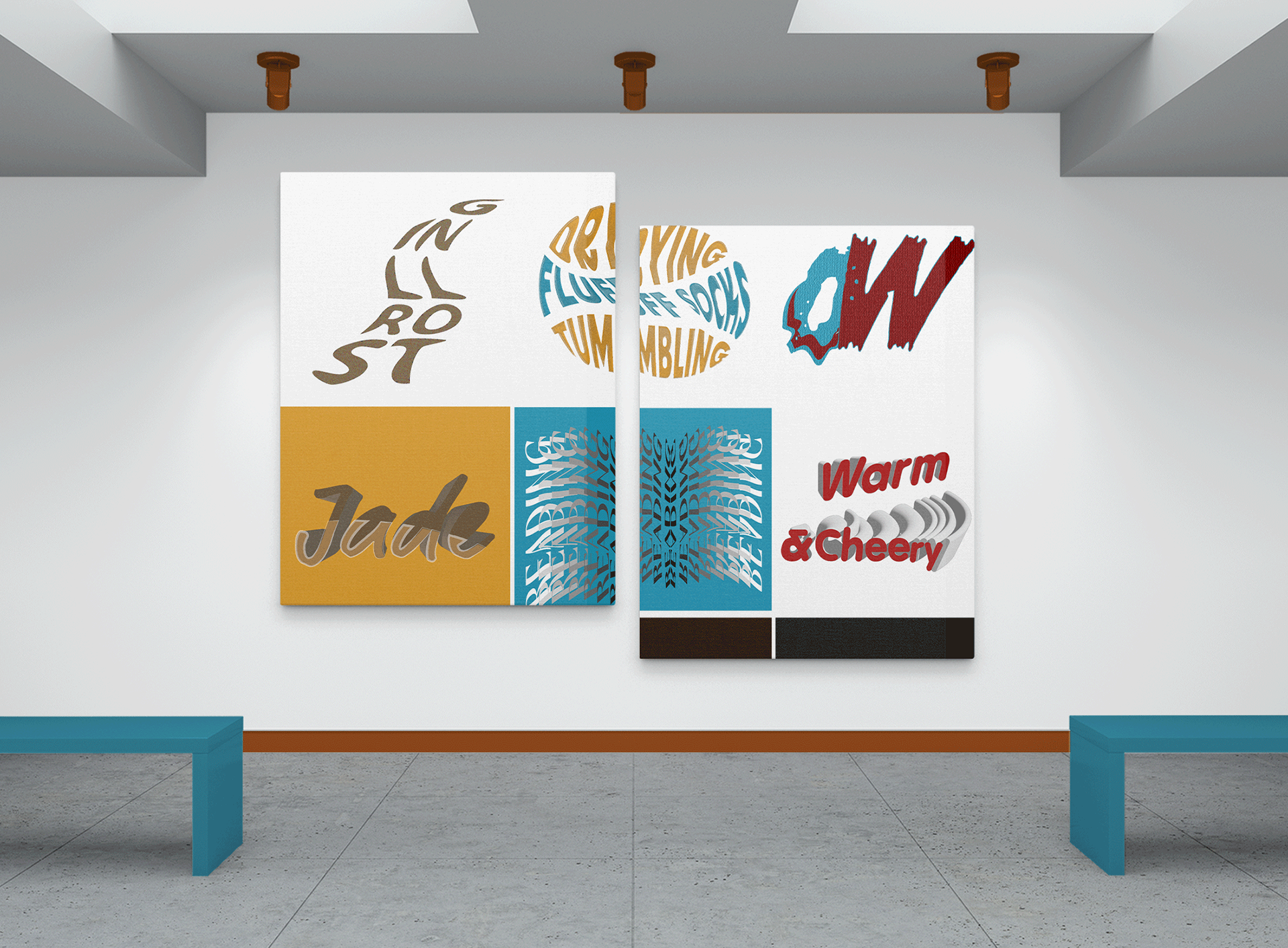
Typography
Futura PT Book Oblique mimics a welding rod, imitating the industrial and dynamic movement.
Colour
The blue symbolizes trust and "darkness" as in the name. Orange represents sparks, quality work, and financial value.
Graphic
The stinger showcases one of the welder's specialties and unique skills.