
The goal was to establish a successful corporate identity through visual assets, brand standards, business collateral, and a marketing campaign.
Memorable brands have a consistent tone of voice, visuals, marketing, and consumer offerings
Challenge
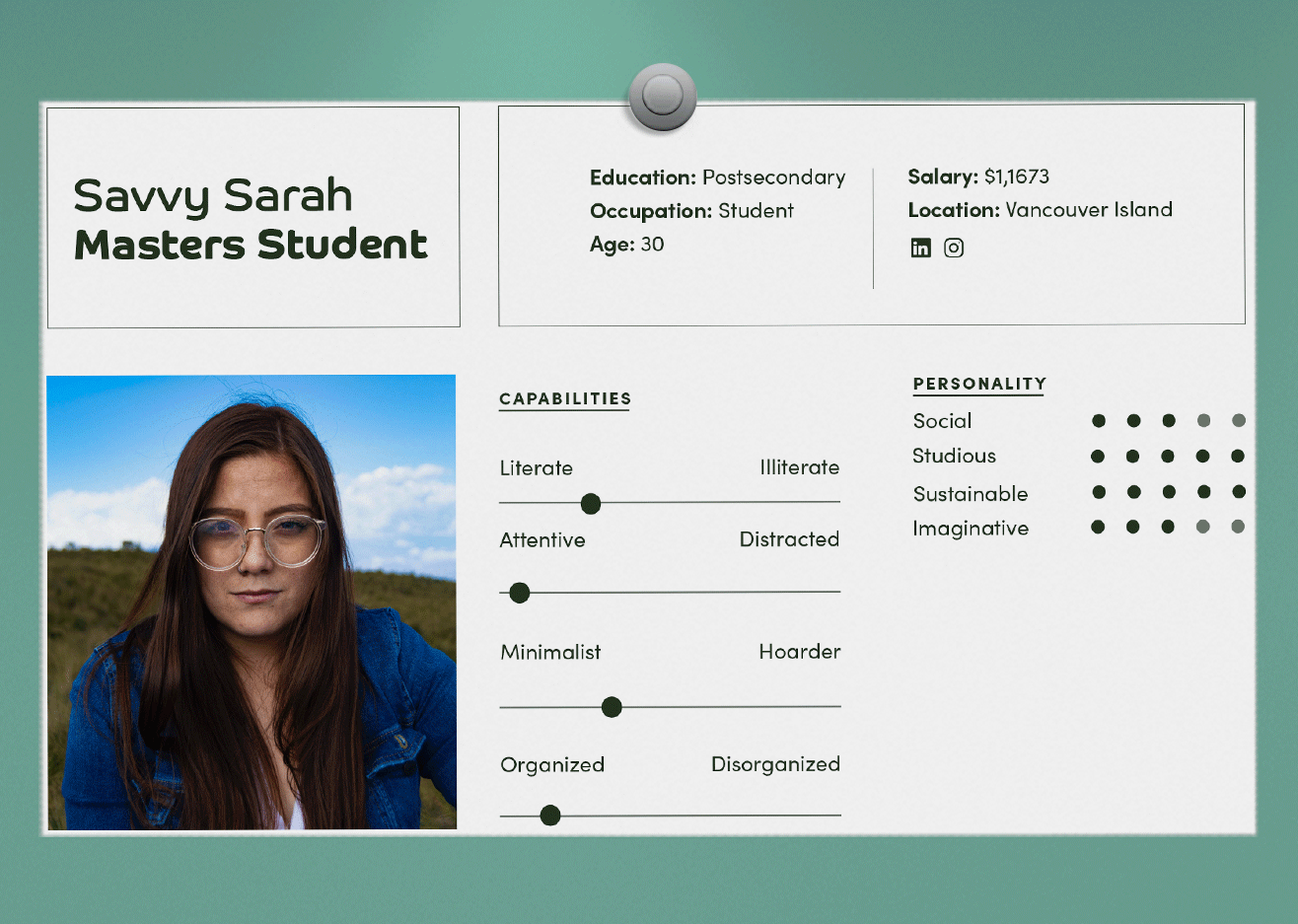
The primary hurdle was connecting with the target audience, who prioritize ebooks for efficiency, cost-effectiveness, and environmental consciousness.


Process
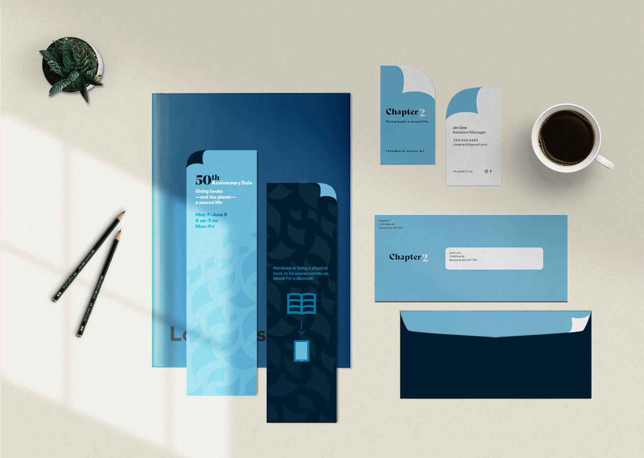
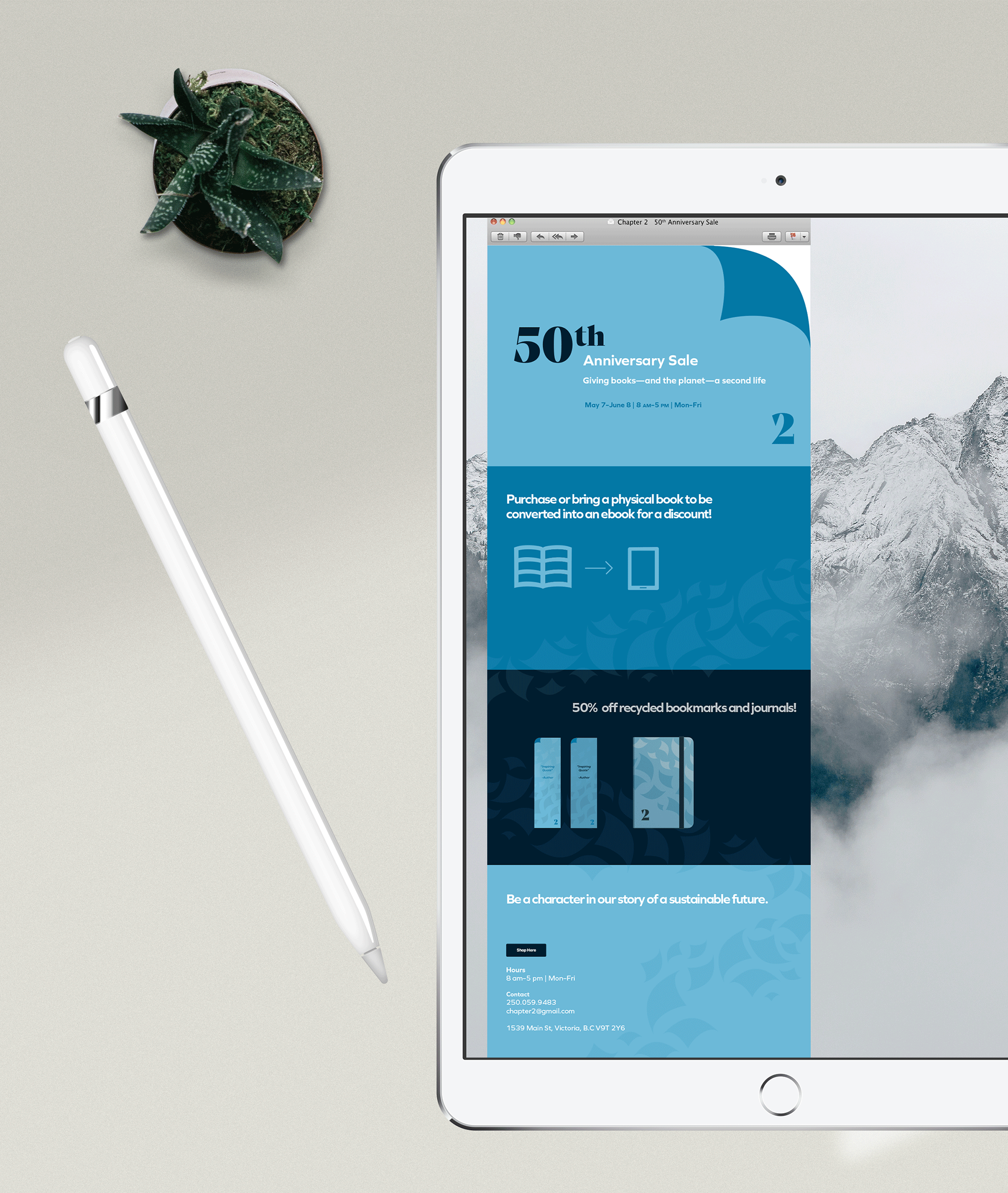
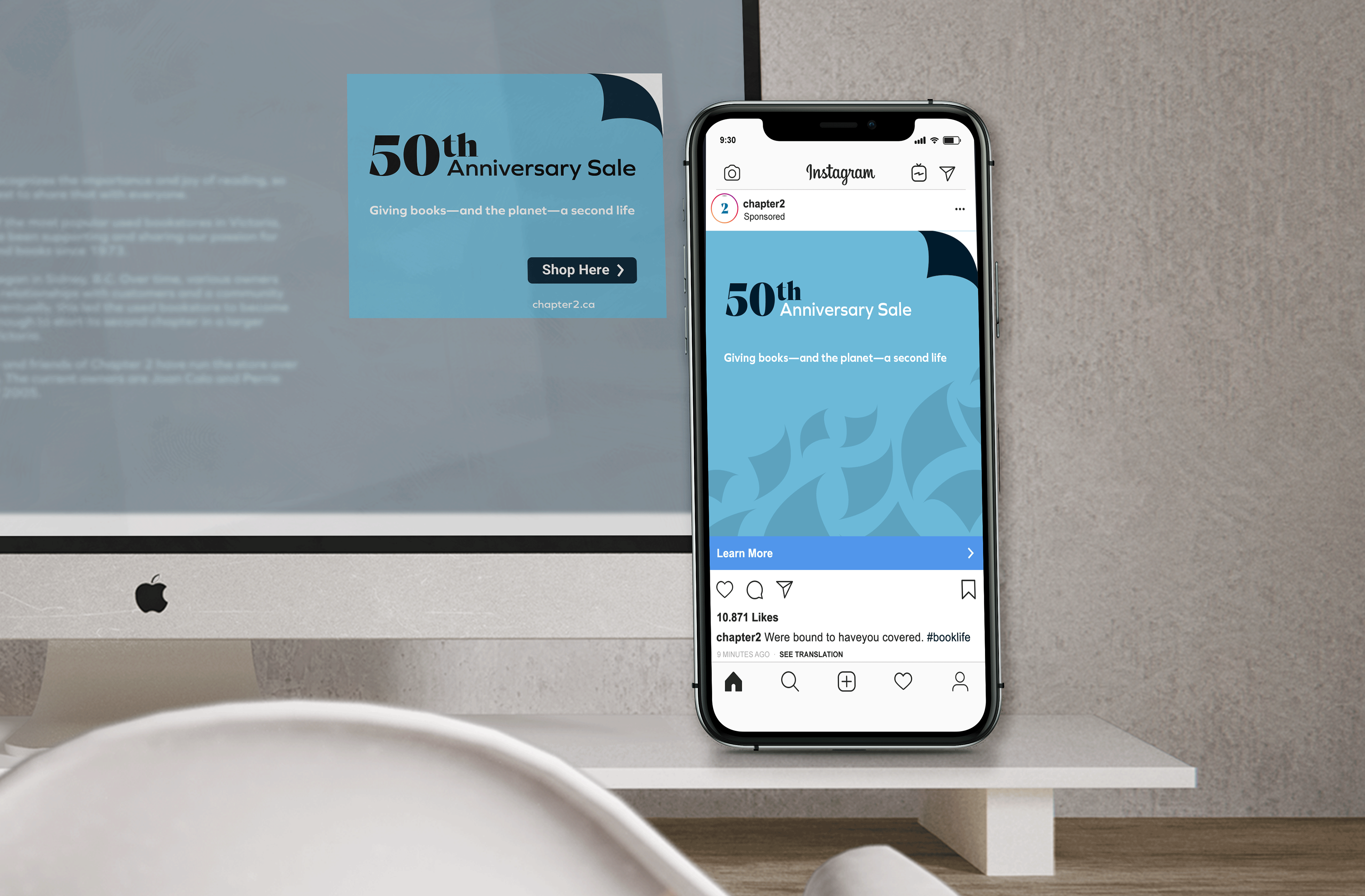
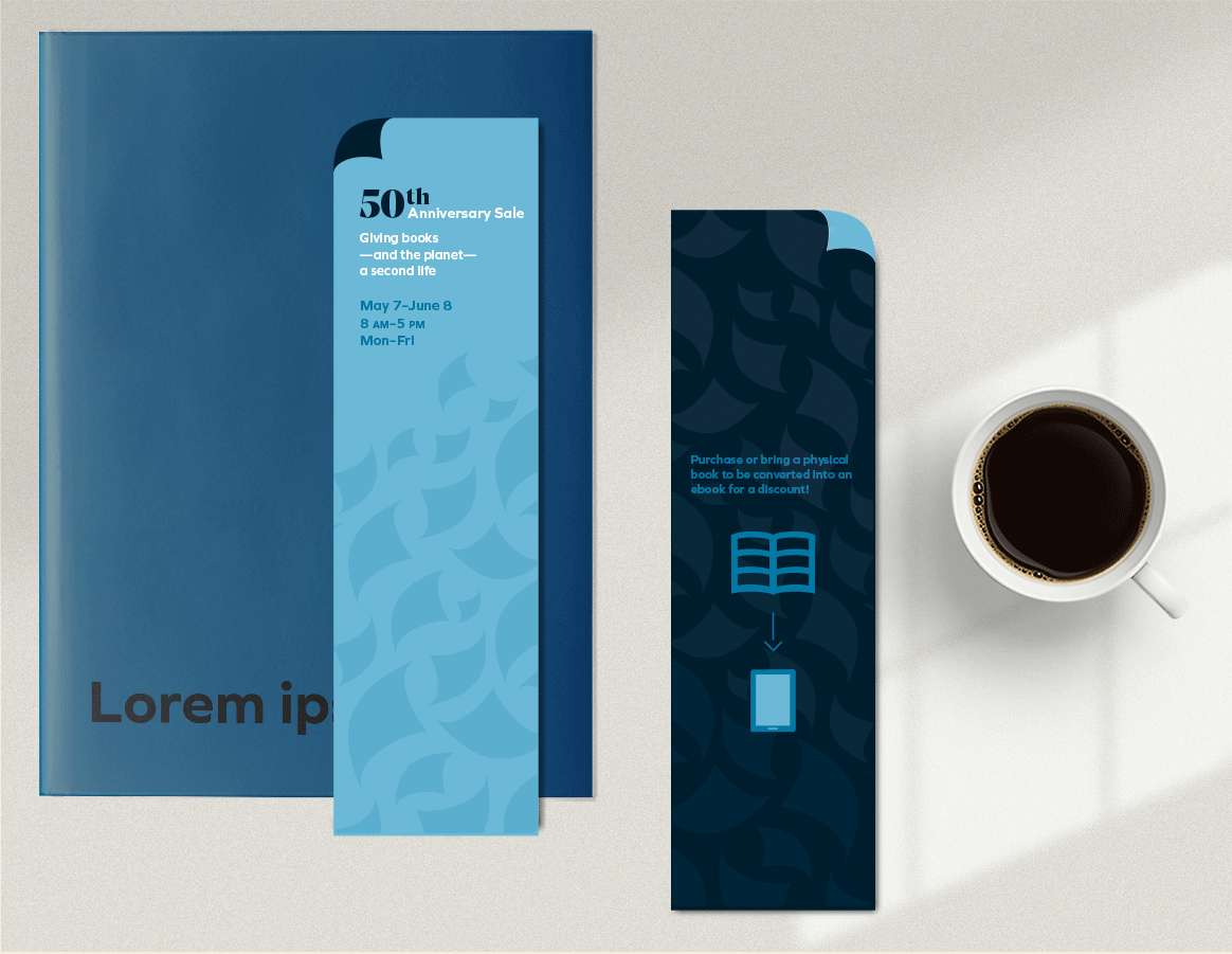
The focus on biodegradability inspired the name "Chapter 2," implying eco-friendliness by giving books a second life.
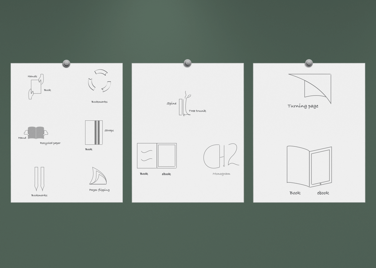
As a result, services were developed to convert books into ebooks and repurpose recycled books into bookmarks and journals.
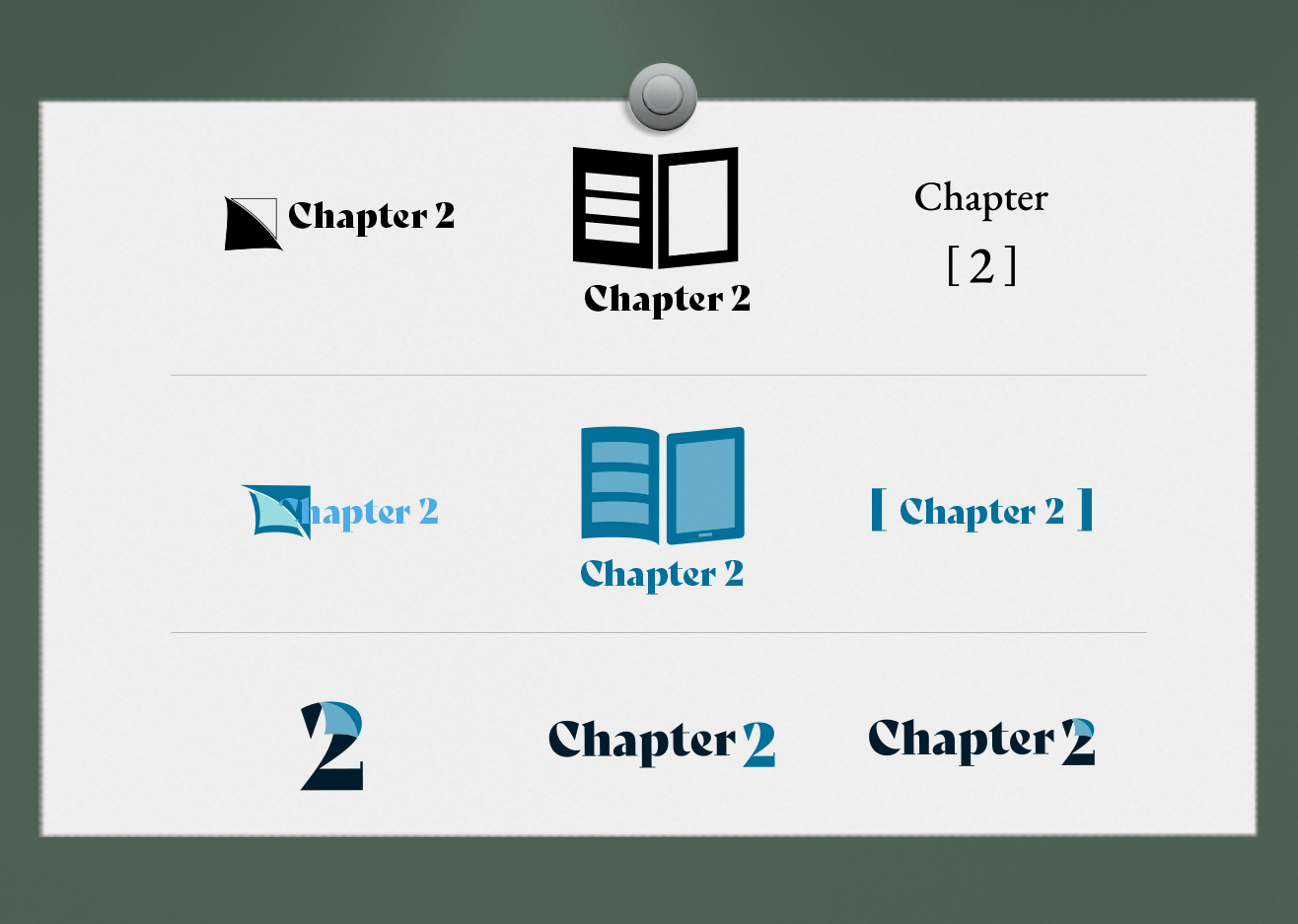
Typography
Bely Display aims to mimic traditional print serifs with a modern twist.
Colour
The blues are to represent Vancouver Island and earth-consciousness while avoiding greenwashing.