This project aimed to use multimedia to construct diverse typographic forms creatively.
Typography has personality, after all, type forms are called "characters"
Challenge
The main hurdle was showcasing gravity's diverse representations, requiring a consideration of physics with creativity.
Each deliverable had to delve into specific typographic designs inspired by gravitational laws.
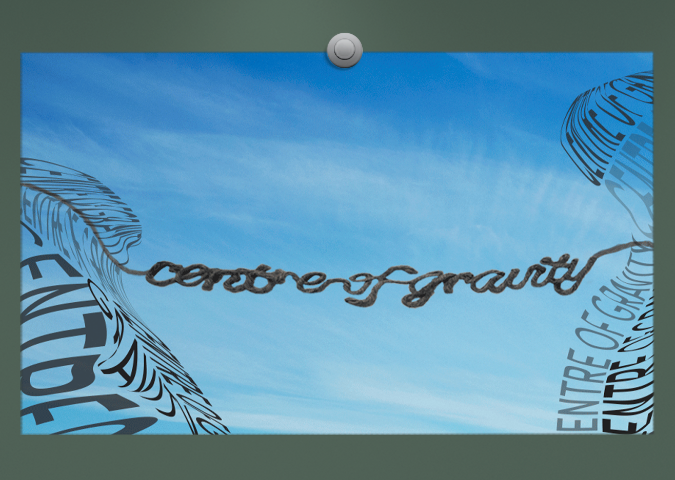
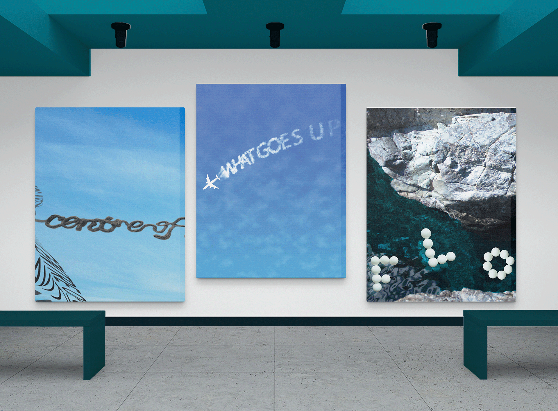
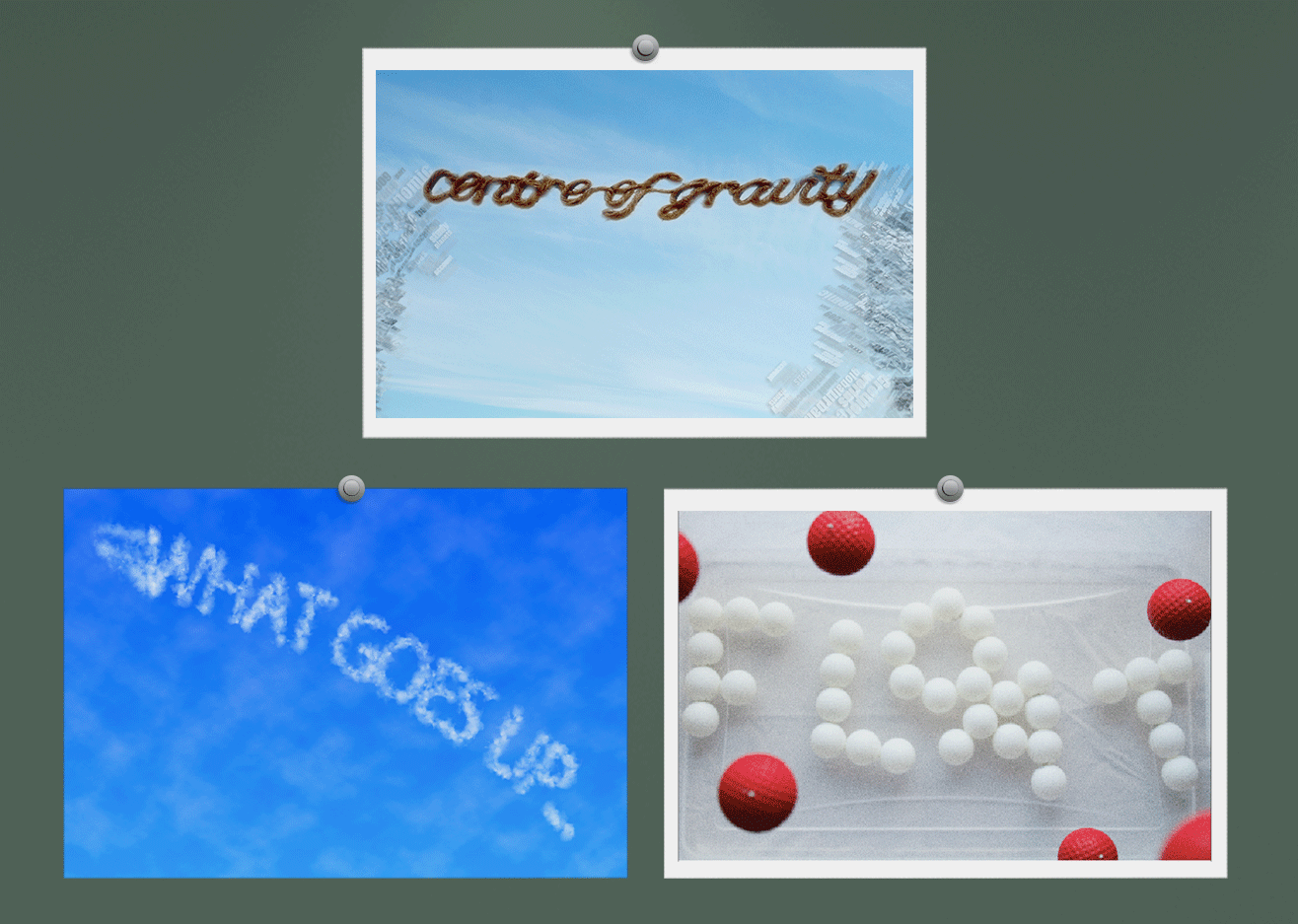
"Centre of Gravity" is crafted from rope to illustrate a tightrope suspended between two cliffs. The phrase is bent to demonstrate achieving and maintaining balance through the law of gravitational force.
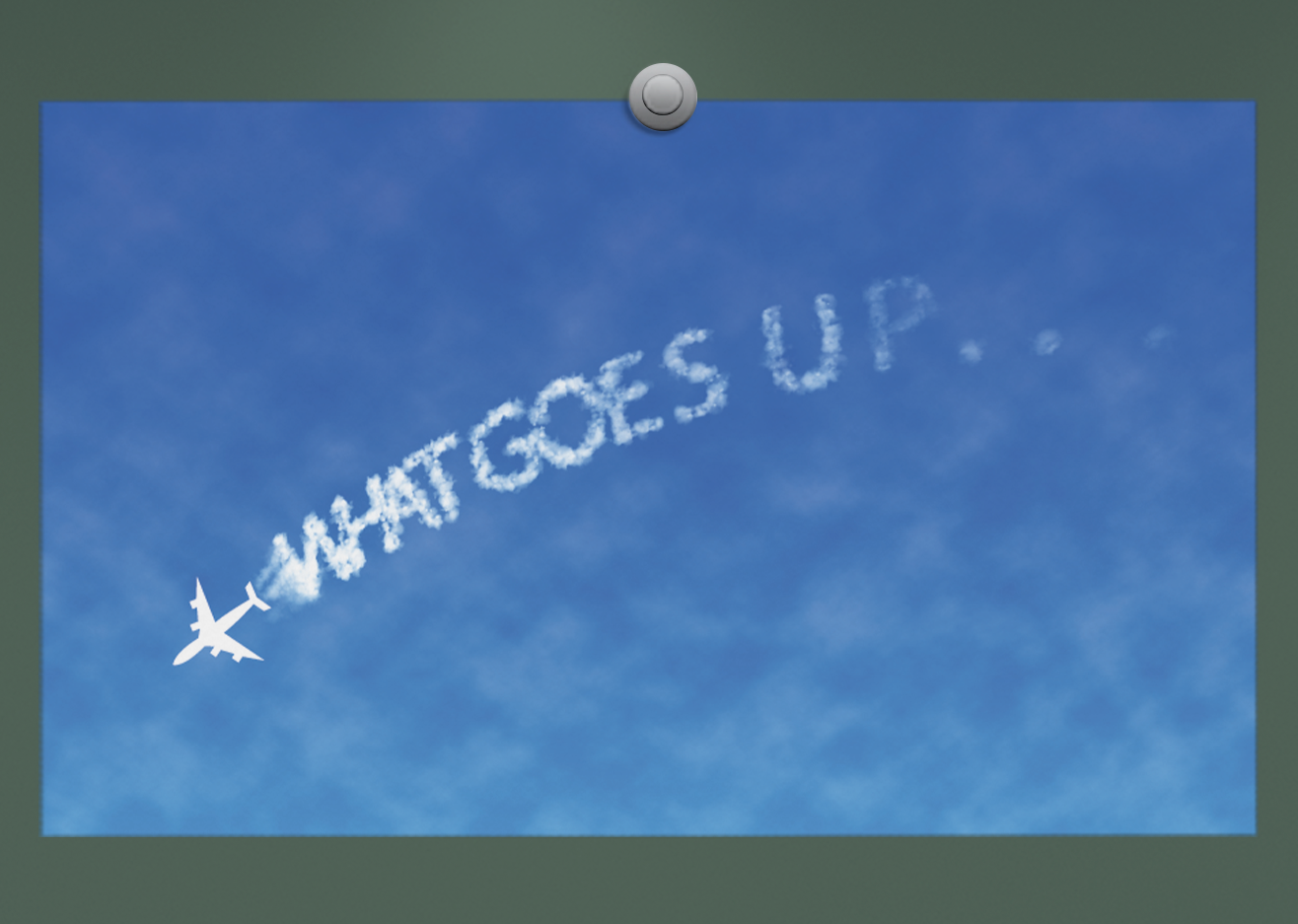
"Newton’s Law," represents just that: "What goes up, must come down." The jet has ascended and is now descending. The tracking gradually widens towards the end, mimicking the dispersion of a jet stream.
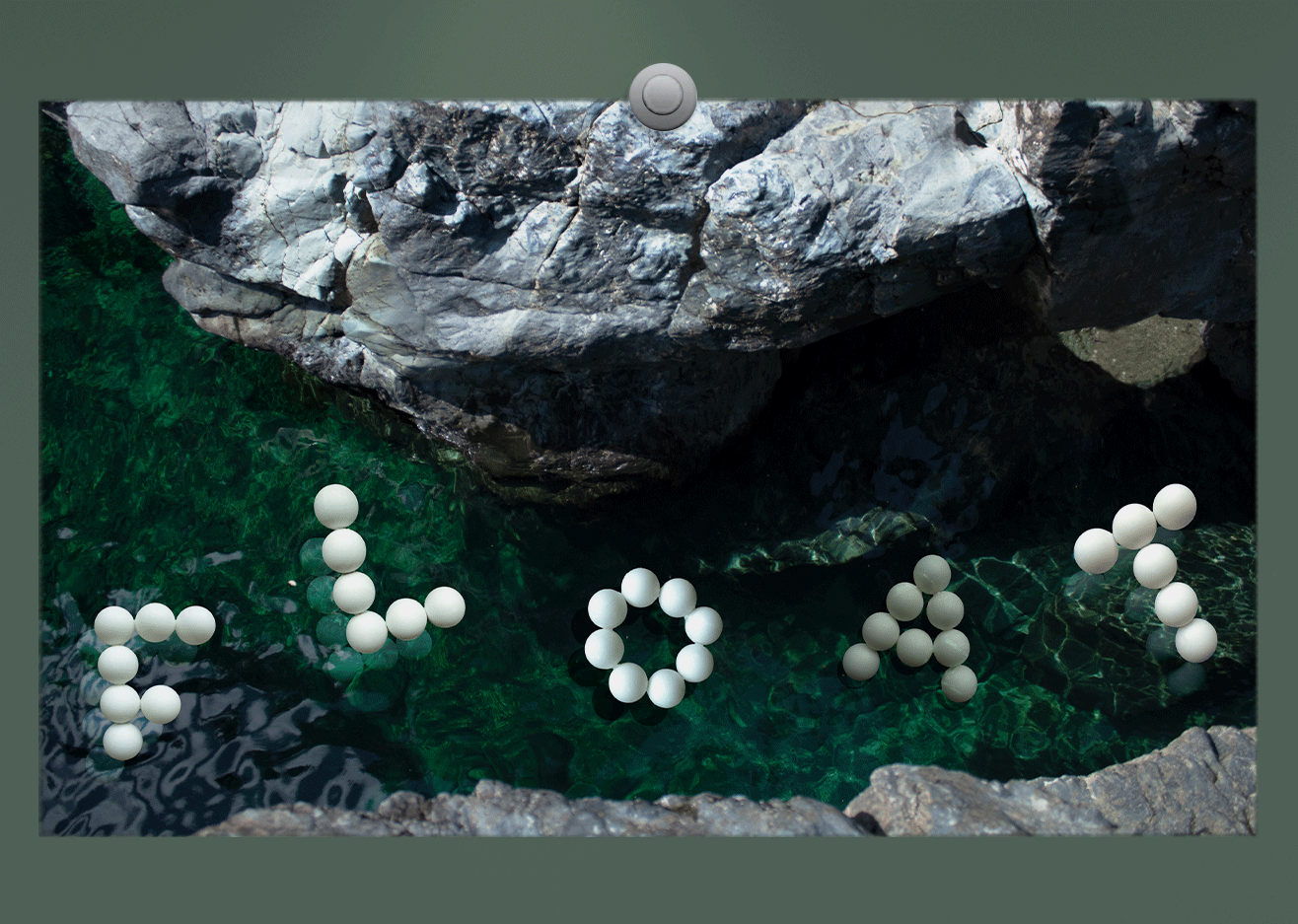
"Float" is assembled using ping-pong balls to exemplify Archimedes' principle, the law of buoyancy. The 'A' is partially submerged for visual interest.
Process
During the research for inspiration, gravity emerged as an intriguing topic. Various digital and physical media were explored to bring each concept to life.
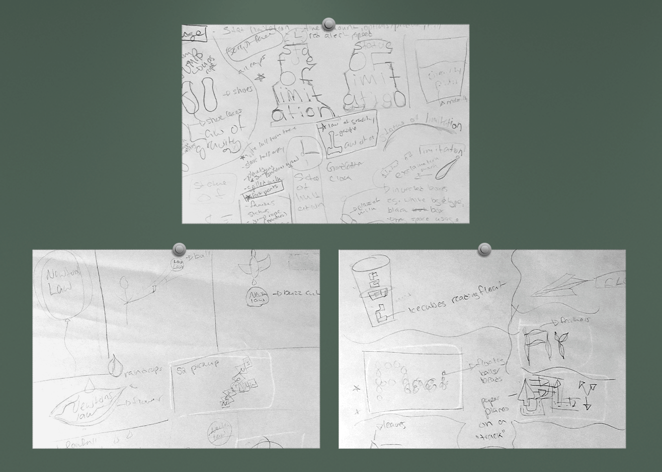
Ideas involved items commonly associated with gravity measurement, including balloons, ice cubes, feathers, paper planes, balls, and more.
Roughs and prototypes required numerous physical setups, continuous adjustments, alterations, and extensive experimentation.